Cabinet colour is often the first thing people want to choose. It feels exciting, visible, and easy to imagine. A soft green kitchen. A deep navy island. Warm white cupboards. Dark timber doors. These choices matter, but they should not lead the whole project.
Colour sits on top of many other decisions. If those decisions are weak, even a beautiful colour can feel wrong. A kitchen may look stylish in a sample photo, then feel heavy, flat, or out of place once it is built. That is why the better question is not “What colour should the cabinets be?” It is “What does the kitchen need to do, and how should it feel inside the home?”
The layout should come first. Before colour, the owner needs to understand where the cooking zone, sink, fridge, pantry, bins, appliances, and preparation areas will sit. A strong layout makes the kitchen easier to use. A poor one can make daily tasks frustrating, no matter how attractive the cabinet finish is.
This is where bespoke kitchen designers can bring a more practical order to the process. They should look at how the household lives, not just what colour the client likes. Do people cook together? Is the kitchen used for homework? Are there pets, young children, frequent guests, or someone who bakes often? These answers shape storage, surfaces, seating, and lighting before colour enters the room.
Light is another reason to wait. The same cabinet shade can look different in every home. A colour that feels soft in a bright showroom may look dull in a kitchen with limited natural light. A bold shade that looks rich online may feel too strong in a narrow room. Window direction, ceiling height, flooring, splashback material, and artificial lighting all affect how colour behaves.
Materials should also be chosen as a group. Cabinets, benchtops, flooring, handles, tapware, walls, splashbacks, and appliances need to sit together calmly. If the cabinet colour is picked too early, every later choice may need to work around it. This can limit better options. It can also lead to a kitchen where each part is attractive, but the whole room feels unsettled.
Maintenance is another point people often miss. Pale cabinets can show marks in busy homes. Very dark finishes may show dust, fingerprints, or scratches. High-gloss doors can reflect light in ways some people dislike. Textured finishes may hide wear better but need different cleaning care. Bespoke kitchen designers should explain these trade-offs in plain terms, not simply present a colour chart.
The wider home matters too. A kitchen rarely stands alone. It may connect to a dining room, living space, hallway, or outdoor area. The cabinet colour should belong to that setting. A sharp modern colour may look strange in a period home if nothing else supports it. A traditional shade may feel heavy in a clean, open-plan space. The best choice feels linked to the home’s architecture and mood.
One useful method is to decide the feeling first. Should the kitchen feel calm, bright, warm, dramatic, earthy, refined, or relaxed? Once that is clear, colour becomes easier. A calm kitchen may suit soft neutrals and natural textures. A dramatic one may handle deeper tones and stronger contrast. A warm family kitchen may need timber, gentle whites, or muted earthy shades.
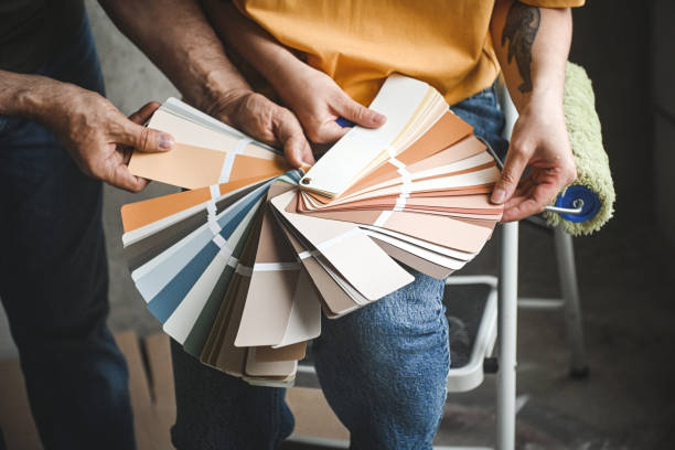
Samples should be tested in the real space. They should be viewed in morning light, afternoon light, and evening light. They should sit beside benchtop samples, flooring, wall colours, and hardware. This small step can prevent expensive regret.
Cabinet colour still deserves attention. It covers a large part of the kitchen and can change the whole mood of the room. But it works best when chosen after the bigger decisions are clear. Bespoke kitchen designers can help make that order feel less confusing. They can guide the project from use, layout, light, and materials towards a colour choice that feels right for years, not just on the day the sample is picked.